SimpleNext.js
How to use antdesign with Next.js
Like chakra-ui, ant design is a componenet library that you can use to speed up the developpement of your next.js app, giving it a nice professional feel.
Why use ant design
ant-design is a componenent library used mainly for react apps, but can also work with next.js apps.
Rich library
Nearly every component you will need is probably provided by ant design, from simple buttons to date pickers or calendar components.
Highly customizable components
You can costumize you components via multiple props, or for more in depth customization, change the .less file
built-in functionnalities
Very handy functionnalities are built into ant design components, for example the table components has filtering and ordering build into the component itself, which is very handy.
RTL and internationnalization support
how to setup
- Open your terminal window and navigate to the place you want your Next.js project to locate in then running:
npx create-next-app next_antd
The name is totally up to you.
- Navigate to the project root folder:
cd next_antd
- Install Ant Design core and its icon set with the following command:
npm install antd @ant-design/icons --save
- Manually import the antd.css file at the very top of your pages/_app.js file:
import 'antd/dist/antd.css';
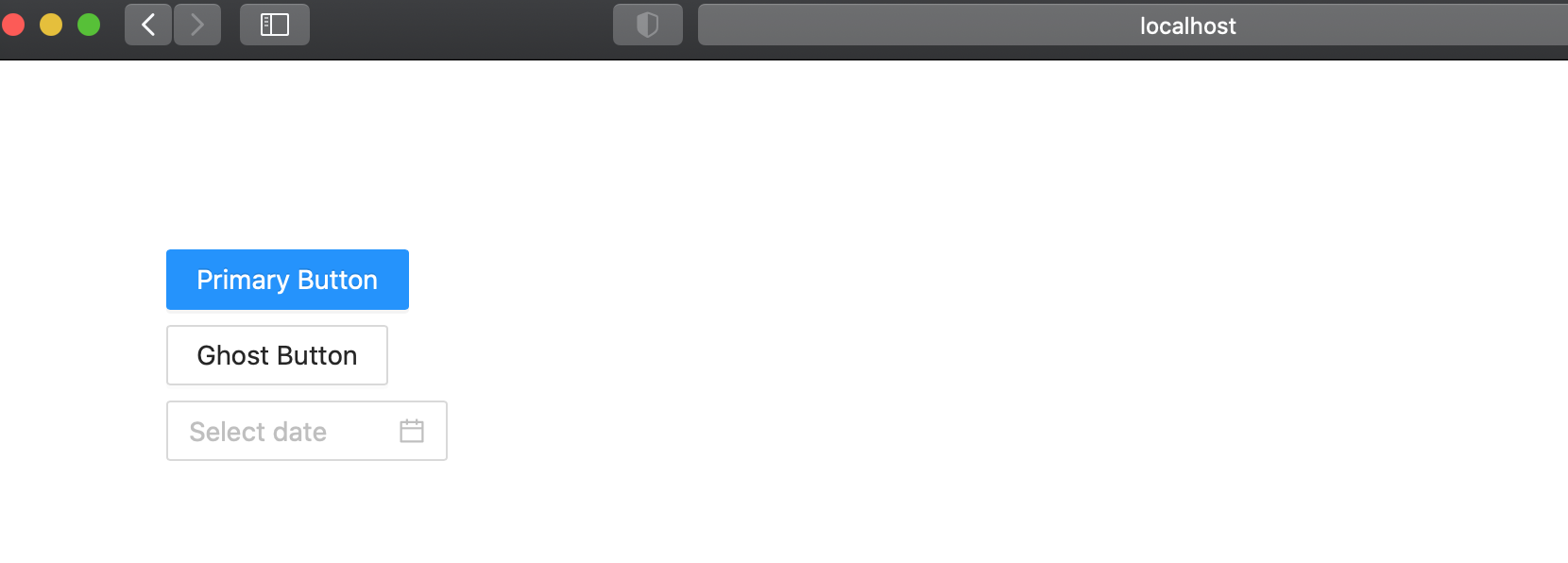
Now, we’re ready to use Ant Design components in our Next.js app. For example, we will modify our pages/index.js to add a normal button, a ghost button and a date picker :
import { Button, Space, DatePicker, Card } from 'antd';


export default function Home() {
  const onChange = () => {};
  return (
    <div style={{ padding: 100 }}>
      <Space direction="vertical">
        <Button type="primary">Primary Button</Button>
        <Button type="ghost">Ghost Button</Button>
        <DatePicker onChange={onChange} />

      </Space>
    </div>
  );
}
this is the result :
You can also customize the default theme to suit your design needs.


